MATPLOLIB: 데이터 시각화(1)
Chapter 02에서 배울 내용
- Basic plots
- Scatter plots
- Other plots
01 Basic plots
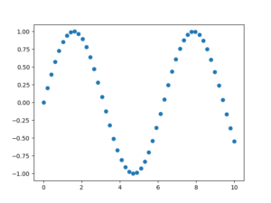
import numpy as np
import matplotlib.pyplot as plt
%matplotlib inline

x = np.linspace(0, 10, 50)
sinus = np.sin(x)

plt.plot(x, sinus)
plt.show()
 linspace 함수 np.linspace(start, stop, num, endpoint, retstep, dtype)
plt.plot(x, sinus, "o")
plt.show()
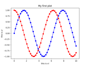
cosinus = np.cos(x)
plt.plot(x, sinus, "-b",  x, cosinus, "-r", x, sinus, "ob", x, cosinus, "or")
plt.xlabel('this is x!')
plt.ylabel('this is y!')
plt.title('My first plot')
plt.show()
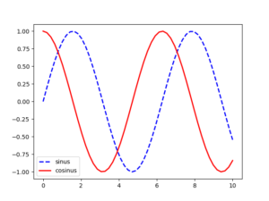
cosinus = np.cos(x)
plt.plot(x, sinus, label='sinus', color='blue', linestyle='--', linewidth=2)
plt.plot(x, cosinus, label='cosinus', color='red', linestyle='-', linewidth=2)
plt.legend()
plt.show()
02 Scatter(2D) plots
Load dataset
try:
    salary = pd.read_csv("../1.csv")
except:
    url = 'https://raw.github.com/duchesnay/pylearn-doc/master/data/salary_table.csv'
    salary = pd.read_csv(url)

df = salary
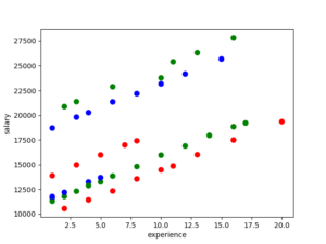
Simple scatters with colors
colors = colors_edu = {'Bachelor':'r', 'Master':'g', 'Ph.D':'blue'}
plt.scatter(df['experience'], df['salary'], c=df['education'].apply(lambda x: colors[x]), s=50)
plt.xlabel('experience')
plt.ylabel('salary')
plt.show()
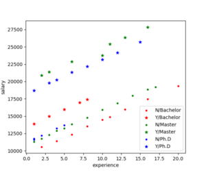
Scatter plot with colors and symbols
plt.figure(figsize = (6,5))
symbols_manag = {'Y':'*', 'N':'.'}
colors_edu = {'Bachelor':'r', 'Master':'g', 'Ph.D':'blue'}

for values, d in salary.groupby(['education', 'management']):
    edu, manager = values
    plt.scatter(d['experience'], d['salary'], marker=symbols_manag[manager], color=colors_edu[edu], label=manager+"/"+edu)

plt.xlabel('experience')
plt.ylabel('salary')
plt.legend(loc=4)
plt.show()